May 2, 2017 Urban design

An addition to Auckland’s hodgepodge Anglican cathedral opens up to the outdoors — and casts a golden glow.
Here is the church/And here is the steeple/Open the door/And see all the people.
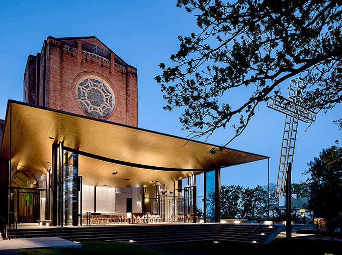
For a start there’s no steeple. Not surprising because the cathedral doesn’t have one either, although there was once a design for one crowning an impressive stand-alone bell tower which never got off the drawing board. But it’s really the phrase “open the door” that architects Fearon Hay seem to have misheard in their radical departure from the norm in church design. Instead of doors, the new chapel opens the walls on three sides with floor-to-ceiling glass so you do indeed see all the people (or their absence) all of the time.
As though that wasn’t open enough, the entire south wall disappears at the touch of a button, silently gliding apart as a motorised stacking slider to completely open the space to the air and the sounds of the surrounding garden, oak trees and sky. The ceiling of this three-sided pavilion, adorned in sumptuous gold leaf, curves up and out from the centre to the perimeter, lifting the eyes skyward. It’s the geometry of a blanket held taut then loosened to drape in the middle. Or a portion of the curve of an upside-down dome. The effect? Some would say transcendental, but at the very least you can’t contain a gasp.
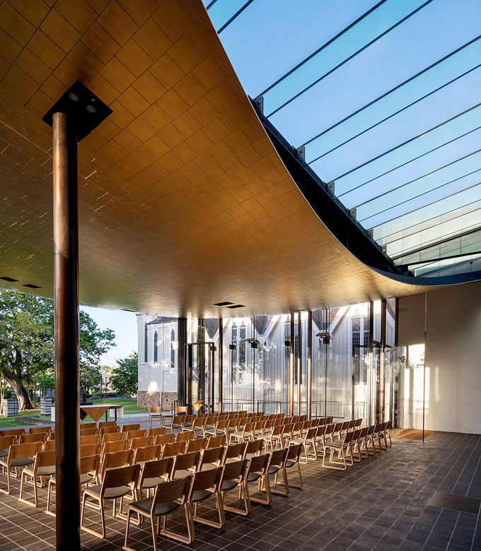
From the inside, the inside-out chapel demands an outward gaze. To what? Obviously the 5.6m cross which, while it’s technically behind the altar — in front of the transparent, sometimes departed, south wall — is outside. It’s see-through, too — a laddered, boxed crucifixion frame of stainless-steel tube and bar, gilded in gold leaf, by artist Neil Dawson. Hovering 8.4m at its apex above the garden lawn amid the oaks, it leans away from the chapel, apparently to create a feeling of ascension.
The sense of looking beyond, whether to a higher purpose or to the landscape view, is also at play in the cross’s alignment with the central north-south axis of the cathedral — the vision of George Selwyn, the first Anglican Bishop of New Zealand, who purchased the site in 1843 for $75. Here, the chapel completes a journey beginning at the northern end in the vast marae-like space in front of the timber- lined nave designed by Professor Richard Toy and completed in 1995. The northern end, with its jagged triple gable and dramatic porch-like overhang, provides multiple references — to the holy trinity, the wharenui meeting house and the adjacent St Mary’s Church, a wooden Gothic Revival masterpiece designed by Benjamin Mountfort and completed in 1888. The wide-span nave, seemingly unsupported thanks to its clever folded-plate structure, accommodates a congregation of around 1100 and joins the towering brick and reinforced concrete neo-Gothic chancel designed by Charles Towle. Its construction was put on hold in 1939, when World War II broke out, and only the first stage was completed between 1958 and 1973.
On either side of the nave are aisled spaces — ambulatories — that until now led to a dead end.
Today, the neo-gothic archways lead to the 130-seat chapel, which in turn opens to the Trinity Garden designed by Jacky Bowring, then a grove of historic oak trees and two columbaria columns for ashes. Beyond the oaks and completing the axis is Maungakiekie (One Tree Hill).
As journeys go, you have to say the cathedral is something of an eclectic mess, a hodgepodge of competing architectural styles, not particularly helped by the clashing array of stained glass and sculpture that adds to the general clamour.
“It’s a lot of additive elements,” says architect Jeff Fearon. “One of the things we were looking for rather than adding another element was whether the chapel could bring things together.” A big ask, but achieved to some extent by the minimalist combination of floor plate, terraces, glass walls and curved ceiling. Plus skilfully bringing a light touch to existing boundaries — keeping a respectful distance from the adjacent St Mary’s façade and detaching, with a strip of glass roof, from the south face of the imposing brick chancel and its ornate rose window.
“There is a lovely delicacy up there that if we wedged a building against it would be lost,” says architect Tim Hay.
“Another boundary was the trees and the garden. We used a lot of what we thought was the beauty of that space and its existing definition.”
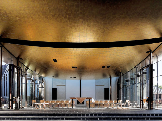
So the chapel is contained by a set of outer boundaries that make it not as open as it might seem. The design does pose a few theological questions. What happens when you create a space where you can actually worship in a garden? Gardens can be a bit problematic for Christians — just ask Adam and Eve. So far, congregations seem to be adapting to their new visibility, although they can apparently be momentarily distracted when tui fly by. Then there’s the question embedded in the nursery rhyme: what’s the essence of a church, its building or its people? In taking away the walls, the chapel seems to be saying the people are paramount. Here they are showing the way. In the face of declining congregations, putting the people on display may be a good revivalist strategy.
You have to ask about the gold leaf. About a kilogram of gold in the form of 50,000- plus gold leaves — a random array of red, platinum and yellow gold — was gilded to the 320sqm of ceiling by Studio Carolina Izzo. In the process, the chapel that almost isn’t there becomes very present. For a church of the people, is this money well spent? The gold might well be used ministering to the poor.
The architects deflect the question. “It is okay to celebrate things that have a sense of beauty,” say Hay. “It’s certainly uplifting,” says Fearon.
There are other answers. Representing sacred space. Providing for the permanence of a cathedral. Even if you’re not religious, you can’t avoid the way the material exquisitely reflects the light, layering the space in a deep golden hue. Sublime.
This article is published in the March- April 2017 issue of Metro.
Get Metro delivered to your inbox

/MetromagnzL @Metromagnz @Metromagnz

