Dec 1, 2016 Urban design

Auckland University’s new Science Centre has a quirky façade that hums with energy.
Auckland University’s new $145 million Science Centre, the unimaginatively named Building 302, has plenty of that kind of diagonal — solid circular steel braces bolted to massive steel flanged columns, all painted red. The muscular structural grid is mostly on the inside, threaded between the 11 floors but revealing itself at various points with a pumping iron pose.
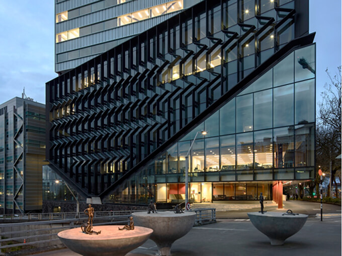
But these are not the same as the whopping diagonals that slice across the building’s Symonds St and Wellesley St East faces in an expansive corner-opening gesture. The slice separates the façades into light and dark — below the line the glass is clear, above it’s smoky and decorated with black vertical aluminium fins that provide further visual distraction, a zigzagging disruption to the vertical line. This is a façade that’s not just busy, it’s humming with energy.
The zigzag fins are ostensibly for sun shading. Patrick Clifford of Architectus points to the carpet on the ground floor, an array of coloured hexagons that may allude to chemistry diagrams. “It’s got a little bit of geometry to it. There’s a little science involved.” It’s also about depth. “We like façade elements that change as you move around them so the oblique view is quite different from the view as you come down, or walk up, the street.”
Then there’s the contextual relationship with St Paul’s, Auckland’s oldest church, diagonally across the road and a building with lots of angles — the gabled entrances, the big gable of the nave roof, the triangle above its rose window. “In our part of the world these diagonals are very much a part of the language of making things,” Clifford says enigmatically.
As for the contextual relationship with the adjacent brutalist Science Building 301, Architectus has been both brutal and sympathetic. The corner part of the building, designed by Ministry of Works architect WR Mitchell and constructed from 1963, has been demolished. Opinions differ as to whether Building 301 was ever a good example of the brutalist phase of modernist architecture, which emphasised the raw and the rugged — lots of exposed concrete, expressed structure, honest materials and repeating modular elements. I tend to the view that the Science Block, which includes the revamped Building 303 facing Princes St, is more about brutality than brutalism.
The six levels of the new building on the corner, rotated to align with the street frontages rather than the university’s building grid, clearly reject brutalism in favour of a quirky decorative façade.
But the five levels of the building above are quietly respectful of the building’s brutalist neighbour. That’s largely through homage to the McCallum red chip precast panels used as exterior spandrels on the old building, and the reuse of the “beautiful fruit salad” scoria as a basement wall. On the new building the distinctive red chip aggregate panels run vertically over 11 levels of the edge beside the old building, providing an elegant transition to the new vertical red zinc cladding.
Inside, the relationship between old and new is dramatically expressed in a narrow atrium of eight levels separating the two buildings. Light rains down into the narrow chasm from a skylight of plastic cushions made of new wonder material ethylene tetrafluoroethylene (ETFE). At ground level, students play table tennis flanked by a wall of open lift wells revealing the ascending and descending cars and, on the other side, the red chip and concrete wall of Building 301.
Next to the canyon is a soaring eight-level-tall space bounded by a rough béton brut concrete wall of sheer brutalism that will eventually be softened by large tapa cloth artwork.
Either side are stairs and ramps, one set going up, the others going down — a novel solution to joining the different floor-to-ceiling heights of the old (3.8m) and the new (4.2m) buildings. Here there’s thin, enclosing mesh stretched taut across the sides of the stairs open to the atrium — a suicide-prevention measure that operates subtly throughout the building, ensuring atrium bridges are enclosed, as are other potentially dangerous edges.
Even though the building has some incredible views from its upper levels — to the Domain and across Albert Park and out to the Waitemata — there are no balconies or roof decks. Designing out potential tragedy is understandable, but you also wonder whether it’s overly protective and, in terms of design, restrictive.
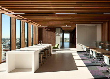
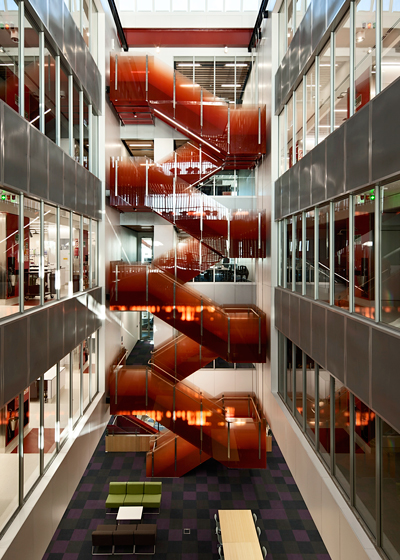
The design handles such requirements so well they are hardly noticed and there are a number of gallery spaces to take advantage of the views. The upper levels are divided by two five-level atriums — one timber-lined for the Psychology Department and the School of Environment, the other in white panels marking out Chemistry’s identity and location. Both have winding red stairs and are lit from the top — Chemistry by a saw-tooth roof with skylights and Psychology via a glass gallery bringing light from the Wellesley St façade.
Clifford refers to the voids as connected rooms — collaborative, collective spaces that are populated with seating at their bottom levels. He describes the design as a series of “sociograms”, diagrams of social interaction around which the architecture is framed.
Nowhere is the idea more evident than on the ground floor, where a wide terrazzo stair with red enclosed balustrade climbs three levels. This centrepiece of the entry atrium is surrounded by furniture and joins large glazed areas opening out to Symonds and Wellesley Sts. Designed for the casual, unstructured engagement of learning, the corner area teems with students, the big diagonals slanting across a parade of people on Symonds St. Occupied and enjoyed, Building 302 is a pedagogical sociogram in a masterful architectural frame.

