Jul 24, 2015 Urban design
Photographs by Patrick Reynolds
Blink and something happens in this city. Just look what they’ve gone and built in Glen Innes.
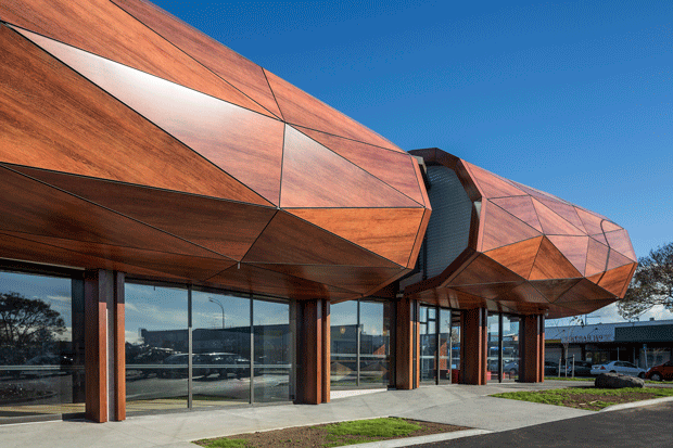
There are so many unexpected aspects to Te Oro — the way it stands proud, a multifaceted jewel gleaming smack in the middle of the shabby, distressed Glen Innes town centre. Yet it clearly belongs here — a defiant signifier of hope and renewal. It tells of legends, of uru: a glen, a grove of trees, an adzed pate/drum, perhaps a hinaki (eel trap). One passer-by, somewhat unkindly, likened it to a worm.
The two really extraordinary aspects of Te Oro, the $8 million Glen Innes Music and Arts Centre for Youth, are that this is a building that speaks, literally, and that its skin, a beautiful glowing timber grain, is not what it seems. Te Oro’s voice emanates from sound cones set into the building’s soffit at six points around its perimeter. Three reinterpret the local legend of Parehuia, the daughter of chief Titahi, and her tending of a karaka grove at the pa on Taurere, Mt Taylor. The compositions, the creation of Matthew Salapu aka Anonymouz, combine music, archival and everyday life sound recordings from the area to tell a multi-generational Glen Innes story.
Three other audio artworks, developed in collaboration with mana whenua iwi, are compositions by George Kahi of Ngati Paoa, Mahu Rawiri of Ngai Tai Ki Tamaki and Jerome Cowley of Ngati Whatua Orakei. The rich cultural sound embedded in the fabric of the building brings Te Oro alive. Combined with the adjacent machine-carved timber columns, also telling a cultural story, it’s an effect that’s at once eerie, tender and stirring.
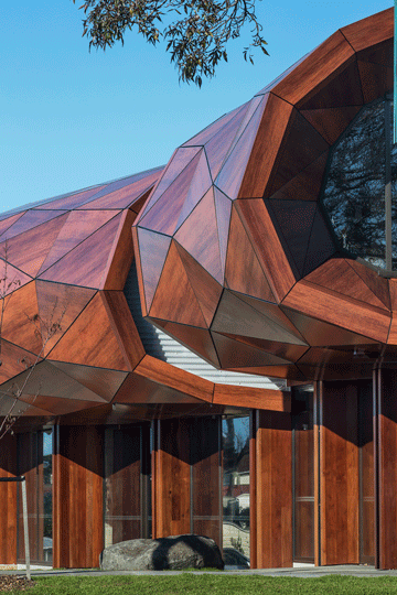
The building’s cladding evokes a similar mix of sensations. Lead architect Lindsay Mackie of Archimedia was convinced from early on that the building had to be in timber, in natural materials. That was also the clear and overwhelming message from the extensive community consultation, which demanded an organic form. “The community was absolutely adamant they didn’t want a square box,” says Mackie. I ask Tamati Patuwai, an artist (Mad Ave Studios) and community leader who has been advocating for GI youth for more than 20 years, why. “I think it’s about being from here, not being put in here like a prefab,” he says. “We are a very prefab community. Prefabs are everywhere —they come and they go.”
The idea of a purpose-built music and arts centre to provide structured activities for young people in GI has been a long time coming. It was first documented in 1995 and subjected to 17 council and community surveys, needs assessments, research projects and feasibility studies, each confirming there was a need. It was first budgeted for during Dick Hubbard’s tenure as mayor but it took until 2012 for the building to finally get the green light.
 The notion of an enduring organic building tied in with the “grove of trees” narrative that announced itself early in the development of the design. The community also played a big part in the placement of Te Oro and its close relationship with three adjoining facilities — Ruapotaka Marae, the library and a community hall. All are linked by a shared landscaped space (still to be completed), which will create a significant new linear park/pathway from the town centre through Maybury and Pt England reserves to the Tamaki Estuary. Te Oro aligns the path with its distinctive ‘S’ shape. The linking idea was called “the body of buildings” and is represented by an enormous manaia (mythological creature) image which will eventually be inscribed across the entire landscape. At the moment, it magically materialises in lines on the footpath outside Te Oro and on parts of its ground floor.
“The building was laden with ideas,” says Mackie. He was working with Ngati Whatua representative and sculptor Bernard Makoare and, as part of Auckland Council’s public arts programme, two local artists, Martin Leung-Wai and Petelo Esekielu. At one stage, with the exhaustive community consultation, the cultural and artistic input, and perhaps some over-anthropomorphising, the building became overburdened. “It was too big an agenda to try to accommodate all of them and we had budget issues, as you always do.”
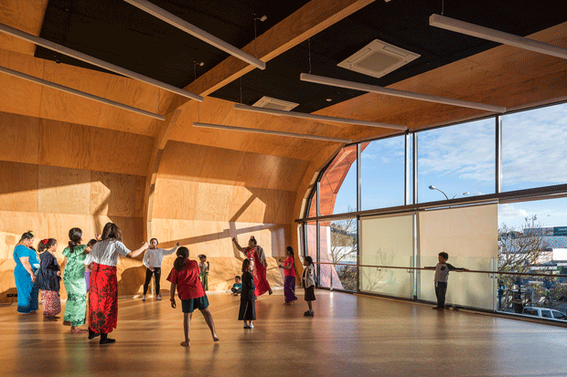
From the beginning, the building had its essential pavilion form — a tier of ground terraces, with a floating, ribbed superstructure above. It’s divided into three parts separated by two glazed circulation areas with leaf-canopy-like skylights, each with different functions. At street level, there’s reception, with dance and music above. The second- floor, timber-lined dance studio, in the curve where the exterior wall meets the roof, has an open, glazed frontage to the street below. “The young people said, almost without exception, when we are doing what we are doing we want to be seen,” says Mackie. The middle pavilion is performance — a huge volume filling two floors where stages can be arranged in various ways — including for performances facing out to the adjacent car park. On the upper level is a digital editing suite and music and recording rooms. The third pavilion, visual arts, includes a jewellery and fine-carving workshop also opening out — here to the park via glazing and deck.
The building always had its shape, function and tree-canopy metaphor. The problem was the cladding. It was going to be a louvred façade decorated with tree images. The breakthrough came when Mackie drew an abstracted sketch of a tree canopy as repeating faceted triangles. He saw leaf folds. His colleagues saw an adzed log, or a Pacific drum. What to make it of? Here Mackie had something of an architectural crisis. He couldn’t use natural timber because he felt that, over time, when it weathered grey, the building would look run down like much of the town centre.
He chose Alucobond, a composite of two aluminium cover sheets with wood- grain polyethylene in between, purpose made in Germany for the job. “As an architect, you must be honest about materials. That timber is aluminium. And that’s just wrong.”
Mackie is still a little anxious about what he’s done. “But when you get close to it, that material is really beautiful.” Indeed. Most wouldn’t realise it’s fake wood. It looks brilliant.
Te Oro, opening its activities to view on all fronts and presenting a spiralling faceted façade that stops you in your tracks, is architecture at its best. It’s a building that gives to GI, a building of its place, a building with heart.

